Can't we do better than NPS?
Why you should think of NPS as a thermometer, not a diagnostic tool
👋 Hi, I’m Kyle and welcome to my newsletter, Growth Unhinged. Every other week I take a closer look at what drives a SaaS company’s growth. Expect deep dive takes on SaaS pricing, product-led growth, public company benchmarks, and much more.
Investors look closely at retention rates as a signal of customer health, product stickiness, competitive differentiation and pricing power. Happy customers are the best long-term store of value at your disposal. They drive word-of-mouth adoption, demonstrate credibility with prospects in the sales cycle, and fuel continued innovation.
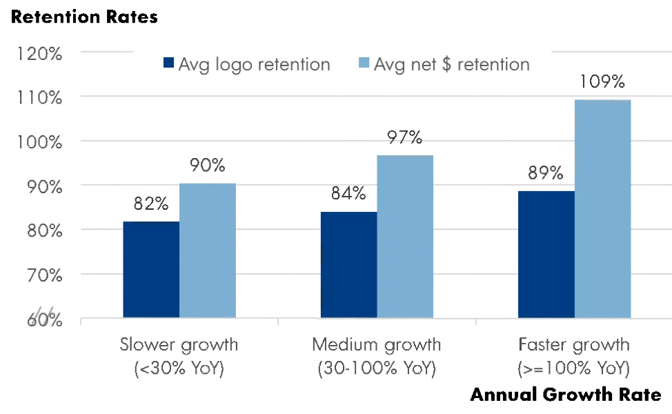
Retention rates—particularly net dollar retention—also strongly predict a SaaS company’s growth rate. The fastest growing SaaS companies see 89% annual logo retention and 109% net dollar retention (NDR) in their cohorts, according to data from OpenView’s SaaS benchmarking survey. That’s compared to 82% and 90%, respectively, among slower growing companies.
Somehow NPS has become synonymous with retention. These days it’s difficult to find a SaaS company that isn’t tracking their NPS on an ongoing basis (or boasting about their impressive NPS relative to peers). NPS is even a Board-level discussion point at many companies.
It’s time to take a step back and ask: Is NPS really the best we can do?
There are certainly some admirable benefits to measuring NPS. To (over-)simplify, tracking NPS:
Enables a culture of customer obsession
Helps you see (and address) unhappy customers before they churn
Creates a conversation across teams/functions to spot and address problems
Allows you to easily benchmark against peers on an ongoing basis
The problem: NPS does not equal retention
NPS doesn’t have mystical powers and it should not be exalted. For starters, NPS doesn’t turn out to be very predictive of logo retention or net dollar retention rates across SaaS companies, according to analysis of OpenView’s SaaS benchmarking data.
There does appear to be a correlation between NPS scores and logo retention rates (left chart), but it is extremely small. For every 10 additional points to a company’s NPS scores, there’s only a 0.9% higher logo retention rate. For statistics nerds out there, the R-squared is only 0.038, which means that NPS only explains 3.8% of the variance in logo retention rates across SaaS companies.
The correlation is even weaker when comparing NPS scores and net dollar retention rates. For every 10 additional points to a company’s NPS, there’s just a 0.55% higher net dollar retention. The R-squared is a measly 0.0053.
Now, to state the obvious, this analysis is comparing across all different kinds of SaaS companies and ignores a number of potentially confounding factors such as the size of the SaaS company, their target customer, and their product market.
Even still, it doesn’t look good for NPS and I think that’s because there are all sorts of measurement issues with collecting NPS data. Just off the top of my head those include:
Low response rates. Even when measured in-app, response rates for NPS surveys aren’t all that great.
Different sampling approaches. Who in the account do you send the NPS survey to—the economic buyer, the champion, the individual users, all of the above? Which accounts do you send the NPS survey to—everyone or only those who’ve implemented the product? Who sends the survey—the sales rep, an independent third party?
Data manipulation. At this point, NPS is such a well known and widely adopted metric that it’s particularly prone to manipulation from respondents.
Sensitivity. By the nature of how NPS scores are calculated (i.e. subtracting detractors from promoters), they’re extremely sensitive to slightly different scores. Every 5 or 6 can have a radical impact on the overall score. NPS scores tend to fluctuate quite a bit month-to-month or quarter-to-quarter for no great reason.
Lack of relevance. Let’s face it: some categories of products just aren’t casually recommended to friends or colleagues (Windows 10, anyone?).
Moving past NPS
It’s certainly fine to track NPS, but let’s be realistic about what it tells us and what it doesn’t. You should think of NPS as a thermometer, but not a diagnostic tool. It can be useful to know your temperature, but it doesn’t always correlate with being sick or well.
You should always read the qualitative feedback behind the second NPS question, the why. This can be an untapped pool of input about the product that’s generated while someone is actually using the product.
And NPS needs to be complemented with other metrics that better predict customer satisfaction, advocacy and stickiness. Here are five KPIs to add to your list.
ACTUAL referrals. NPS scores are a measurement of intention, not action. NPS quantifies how many customers would be likely to refer a product to their friends or colleagues. Why not measure what percentage of customers have actually made a referral and the average number of referrals per customer? Perhaps NPS surveys could be replaced (or supplemented) with actually asking a customer for a referral? This could also be as simple as changing the NPS question from “would you recommend us” to “have you recommended us to anyone in the last 3 months?”
Customer health score. Defining a customer health score is by no means new, but it’s often under-appreciated and neglected. When set up thoughtfully, customer health scores can strongly predict a customer’s likelihood to churn well before they actually churn. They can also be refreshed in real-time across all customers, not just a select few who answer an NPS survey. Let’s redirect some time and resources away from NPS and towards creating a best-in-class customer health score. Here’s how to do it.
CSAT. While the metric has gone out of style, you could simply ask your customers how satisfied they are (happy / sad / neutral). This simple and visual question can yield much better response rates and serve as a useful input into the customer health score.
Product stickiness. One useful emerging metric is to ask customers how disappointed they would be if they could no longer use your product. Would they be “very disappointed,” “somewhat disappointed,” “not at all,” or “N/A—already stopped using it”? If 40% or more of your customers would be “very disappointed” without your product, you’re on the right track. This is a great measurement of product stickiness and product-market fit.
ROI delivered. Roll up your sleeves to ultimately tie an ROI to your product that’s so compelling your customer never wants to leave. An added bonus is that you can repurpose these ROI studies for case studies and sales collateral.
This post was originally published on the OpenView blog.