You need a better testing strategy
Lessons tracking 25,000 split tests from the top tech companies
👋 Hi, it’s Kyle Poyar and welcome to Growth Unhinged, my weekly newsletter exploring the hidden playbooks behind the fastest-growing startups.
“Hey, can we test this?” If those five words sent a shiver down your spine, today’s guest post might be for you. The tech industry has a borderline obsession with testing. In my experience, the vast majority of this testing is garbage-in, garbage-out — leaving us with few new insights and a lot of wasted effort.
My friend, and past contributor, Casey Hill recently joined DoWhatWorks as CMO. DoWhatWorks removes the guesswork from website optimization by analyzing growth experiments across 2,000+ companies (they’re tracking 25,000 tests and counting). Casey chimes in this week to share exactly what he’s learned from all that data.
I’ve worked in software for the past 15 years, at Techvalidate (acquired by SurveyMonkey), ActiveCampaign, and now as CMO of DoWhatWorks. While each experience was different, there was one consistency: A/B testing.
At ActiveCampaign, we tested everything from email subject lines, to website copy to onboarding product flows (and I wrote about some of what we learned). Now at DoWhatWorks, I have the good fortune of sitting on a dataset of more than 25,000 A/B tests run across the most beloved brands out there. We track everything from specific companies to page types, sector, elements tested, recency, etc.
The more time I spend around testing, the more I’m convinced that A/B testing is broken. First off, only 10% of A/B tests tied to revenue beat their controls. This means we’re not only spending an untold amount of time, energy and money on tests that don’t work; we’re actually losing millions of dollars putting these tests in front of our audience only to see conversion suffer.
The problem is actually much more insidious, though. Brands are copying losing versions of their competitors’ sites – meaning the same tests keep failing again and again. Teams are blindly copying ‘best practices’, which turn out to be what's most popular and not necessarily what’s most effective. And when brands do finally find a winner, they aren’t implementing it.
Let’s unpack why our A/B testing system is broken and, more importantly, what to do about it.
Fail #1: Teams are copying what’s common versus what’s winning
There is a herd mentality when it comes to certain aspects of web design. But oftentimes, when tested head to head, these ‘best practices’ lose.
For years, in B2B SaaS, the ‘best practice’ was always one CTA in the hero. But more and more, when top brands test one vs. two CTAs head to head, the multiple CTA’s are winning. I’ve seen this with Slack, Shopify, Intercom, Loom and many others.
In my experience, what likely dictates the best path for a brand is based on (a) how homogenous your traffic is and (b) whether your product is meant for self-service, enterprise or both. The average B2B SaaS business has a diverse traffic base and is trying to appeal to both self-service and enterprise segments.
Another legacy best practice: simple backgrounds convert better on checkout or register pages. In B2B SaaS, we find the opposite is often true. Below is a split test from Canva, where the illustrated background was the clear winner.
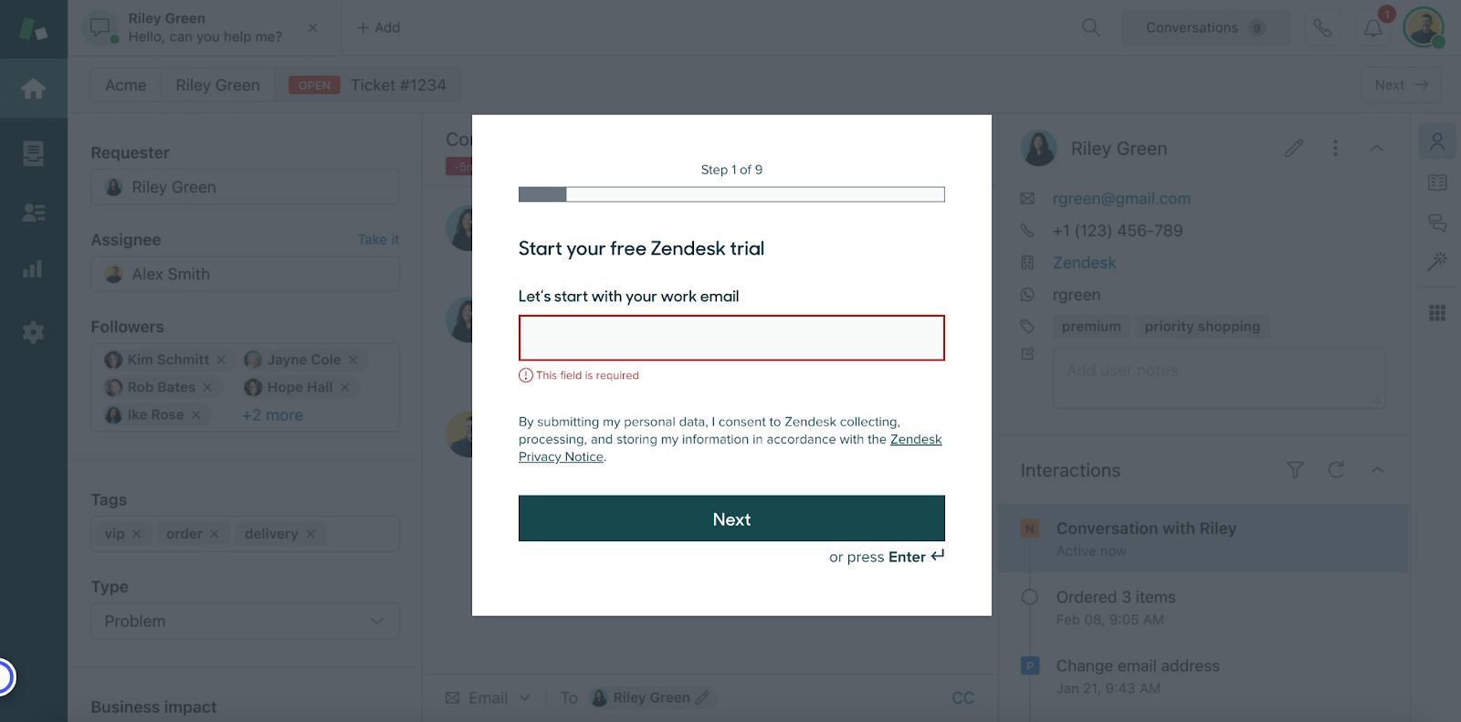
I’ve been seeing plain backgrounds lose out for dozens of other SaaS products, from Zendesk to Gorgias.
An emerging SaaS strategy is to use a semi-opaque background showing the product.
of the fantastic newsletter did a detailed analysis on this very thing. He found huge lifts for the semi-opaque background variant: a 25% conversion lift for MineOS and 94% lift for MyCase.Fail #2: Teams are leveraging outdated experience
Around 2020, most SaaS pricing pages defaulted to showing monthly pricing.
Then someone realized they could charge annually as default but display it as monthly – making their product look more affordable. Now, a large portion of B2B SaaS brands do this.
During the last few years, nearly 30% of the top 100 B2B SaaS brands switched their pricing pages, defaulting to displaying the price per month when billed annually. Intercom is one such example, and they made the switch in 2022.
Another example here is reassurance subtext. This is text below a CTA that says things like “No Credit Card Required” or “Free Forever”.
These used to be uncommon below major CTAs, even on pricing or sales pages. Now we see it across top companies like Twilio and ActiveCampaign – and we see it continually winning out in tests from top brands like Shopify.
I’m constantly keeping an eye out for the tastemakers who are setting trends for the rest of the market. Clay is one example, and they’re the first company I’ve seen do this. In their list of customer logos, they indicate which ones link out to case studies.
DoWhatWorks has analyzed hundreds of A/B tests around customer logos, and logos lose at a very high percentage. Buyers are numb to the generic logos, with no ability to validate or contextualize them, that sit on 80% of SaaS websites. Clay strikes a compelling balance with a mix of social proof (G2 rating, growth community) and interactivity, letting folks actually engage with the case studies.
The point is, customer preferences change, and tests need to adapt based on what has the best chance of succeeding today. If you are using the ‘best practices’ from 2020 and applying it to 2025, you are in for a rude awakening.
Fail #3: Teams aren’t implementing their winners (especially with AI)
Here is where the research gets really interesting.
A handful of brands, like GoDaddy, ran a test on AI verbiage in the hero header of their website less than a year ago, and the less AI-centric version appears to have won out. (It turns out that customers might not care about an “AI-powered” message.)
But fast forward to today, and it’s all about AI in GoDaddy’s header, subhead… really everywhere on their website.
This same pattern has been repeated at companies like Talkdesk and Prezi. They test aggressive AI positioning on their homepage, the test seems to lose, and yet they end up going all-in on an AI message anyway.
I don’t know exactly what’s happening in each situation. That being said, there’s a real pattern at play.
My suspicion: the positioning that resonates best with customers isn’t the positioning that resonates best with investors, boards or the long-term vision of the company. And internal pressure ultimately prevails over the A/B test data.
There might be a sunk cost problem at play as well. Brands are spending major sums on campaigns and collateral to beef up their AI credentials. When a brand spends that much money, they’re incentivized to stay the course – even if conversions drop as a result. (This tends to happen with videos in the hero of a homepage as well. They consistently lose when A/B tested against less expensive static images or GIFs.)
Where are we headed?
In the paid advertising space, we saw a substantial shift around 2018 where more and more teams stopped using manual targeting (and rough guessing) and switched to using the powerful algorithms of Facebook, Google, LinkedIn, etc. to help optimize for them. They would simply upload a list of their customers and prospects and tell the ad engines to find a ‘lookalike’ audience.
Online split testing needs to go through a similar evolution – or it’ll be abandoned as a dated and expensive relic. The best teams will:
Learn what the 10% of split tests that win are and use those trends to inform their testing strategy. (Platforms like DoWhatWorks can provide this data.)
Align stakeholders before implementing a test on the website. There’s more that goes into positioning, messaging and UX than just what converts at the highest rate – let those conversations inform your testing strategy rather than be blindsided after the fact.
Refresh their assumptions as audience behavior changes.
Run fewer A/B tests, but concentrate time and resources on the ones that can really make a difference.
The insights about test AI-centric messaging is super interesting, will be very curious to see how this plays out!
Super interesting! I love the breakdown of plain vs. designed/product backgrounds for signup pages. So often we are fed the generic advice of just make everything minimalist. Simple. Less is better. But that isn’t some universal truth. We aren’t are trying to copy Apple. In reality, it’s often clarity and proper expectation setting that wins.