Surprising lessons from 20,000 experiments
An inside view into what works (and what doesn’t) to improve website conversion
Welcome back to the 12th edition of The Gist by Growth Unhinged where I give you one specific action item to grow faster. Past editions have covered how to deal with fake accounts, how to ask about willingness-to-pay, revisiting your automated email program, and rethinking “time savings” as your central value proposition.
In this edition: what growth experiments not to run. Specifically, what you shouldn’t add to your website, statistically speaking. Yes, this is your excuse to kill something from your backlog (finally!).
Helping me out is Andres Glusman, former VP of product and growth at Meetup and current founder and CEO of DoWhatWorks. Andres and his technology have detected and analyzed growth experiments from every major brand – more than 20,000 experiments and counting. DoWhatWorks uses that data to help major brands grow faster. Now they’re letting Growth Unhinged readers use some lessons from everyone’s tests to get better results.
Let’s dive in 👇
The Gist
To improve website conversion, try doing less. Simple and straightforward beats complicated and overworked.
Why you should care
Growth experiments are almost always about addition:
What if we add more social proof?
What if we add a video?
What if we add an email capture box?
Adding things is how we justify our contributions and expertise… right?! Lately, the evidence proves it’s often better to remove rather than add. Especially when it comes to social proof.
Simplified and stripped down keeps prospects focused on completing the core action you want them to do. And it exudes a sense of confidence that the brand (and product) stands on its own without unnecessary clutter.
Tell me more
I asked Andres to investigate the growth experiments that get tested all the time yet almost never seem to work. Many are tests related to adding elements. Three specific ones stood out as exceptionally poor bets based on the proprietary BetScores calculated by DoWhatWorks.
1. Social proof in B2B plan selection
When designing a pricing page, we want to put ourselves in the best possible light. Social proof justifies our pricing and might put a buyer’s lingering fears to rest. In fact, the ‘strategic logo bomb’ was flagged as a quick win in a recent byline in this newsletter.
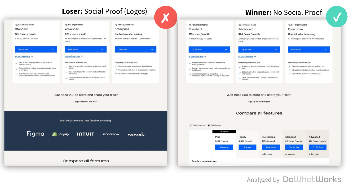
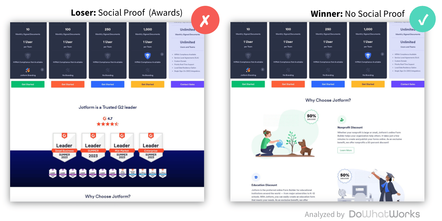
But data shows these tests rarely work when they go head-to-head against a simpler alternative. In fact, DoWhatWorks gives not showing social proof a BetScore of 85 (their scale runs from 1 to 99). This means your team’s limited bandwidth would be much better spent working on something else.
Recent examples they’ve tracked include Dropbox, Jotform and Glofox (all shown below). At Jotform, for example, the simpler “why choose Jotform” messaging was ultimately preferred rather than inserting an extraneous “Jotform is a trusted G2 leader” section above it.
I suspect this will come as a relief to many; removing the social proof section also means not needing to constantly update this section at the whim of executives or finicky enterprise customers.
2. Videos on the homepage
How-to videos are fantastic marketing assets. They breathe life into your website by giving you an opportunity to explain who your product is for, what it does, why it’s worth buying, and how to use it.
They might also be distractions that slow down your website and – even worse – hold visitors back from experiencing your product firsthand. DoWhatWorks gives these tests a BetScore of 23 after reviewing 56 separate experiments. Looking at adding videos on homepages alone, the BetScore went down to a paltry 11.
“On home pages, we saw videos lose to photos, illustrations, logos and more,” Andres said. “We even saw them lose to nothing at all. Unless you are selling video content, using video on your homepage could be hurting your results.”
Andres suspects that consumers want to quickly jump to answers and videos do not always give that answer quickly. You consume videos linearly and never know when or if they are going to actually give the answer you want. It’s also hard to watch a video when you’re multitasking between Zoom meetings and evaluating products (not that I’ve ever done that before…).
Recent examples of folks scrapping their homepage videos include Homebase, 1-800-Contacts, and RingCentral. Sticking with images proved more effective.
3. Strikethrough pricing
Strikethrough pricing – where you show the “old” (higher) pricing, cross it out, and then highlight the “new” (lower) pricing – feels like a way to make customers feel like they’re getting a great deal.
Customers don’t seem to agree. It turns out that strikethrough pricing has a BetScore of 20 based on 22 experiments run by subscription brands.
Spotify, for example, appears to have been eager to prove out strikethrough pricing with four separate variations. The winner ended up being the simpler (no strikethrough) version.
Interestingly, Andres shared multiple examples (like the one below) where SaaS companies tested lower promotional pricing with the strikethrough against full price (no strikethrough) offers.
My suspicion is that there’s a time and a place for these offers – and the right time is not when someone is first landing on the pricing page. The pricing page is for educational purposes, helping prospects understand how pricing works and whether the product is in their budget range. It’s often better to save the promotions (and resulting strikethroughs) for later in the buying process, for example as folks are approaching trial expiration or are hitting a usage paywall.
The TL;DR
The data is clear: when it comes to improving conversion, try keeping it simple. This applies to marketing emails (skewing toward unformatted and conversational), landing pages (“ugly” but functional), and messaging (fewer lofty brand promises).
Heck, the most viral album cover of the year was plain text in arial font over a chartreuse green background. Today it's all about the edit.
For more insights into what works (and what doesn’t), don’t miss the DoWhatWorks newsletter.
What else you should know
📚 To read. Salesforce has been synonymous with seat-based pricing for the last 25 years. Here’s why that’s about to change.
🎙️ To join. Tomorrow I’ll be unpacking how to monetize generative AI alongside Steven Forth and Michael Mansard. Is this the dawn of success-based pricing?
🍺 To meet. I’m heading to Dublin for SaaStock on October 15-16 where I’ll give a sneak peek 👀 of the 2024 SaaS benchmarks results. See you there?
Super useful Kyle and Andres, thank you!
Especially the last part was very surprising.
This is such a valuable piece here. Cheers to you and Andres for sharing