
Most GTM teams I talk to are barely scratching the surface in terms of what’s possible with AI. It’s not for lack of trying. It’s lack of AI readiness.
My friends at ZoomInfo introduced their new AI Readiness Assessment evaluating 12 factors that could make or break your AI ROI.
In only two minutes you’ll discover (a) your AI readiness across data, strategy & execution, (b) specific gaps that could derail your AI initiatives, and (c) tangible recommendations based on your maturity. Test your AI readiness here.

👋 Hi, it’s Kyle and welcome to Growth Unhinged, my weekly newsletter exploring the hidden playbooks behind the fastest-growing startups.
Software products are starting to all look the same. Seemingly everyone is putting the prompt bar front-and-center, perhaps even on the homepage itself. Some of these experiences are magical; others feel haphazard.
I enlisted repeat contributor Yaakov Carno to try out 40 AI products with a prompt bar UX and report back on how to do this well. Yaakov is an expert in the topic; he runs Valubyl, a PLG consultancy that’s helped 30+ software companies improve their self-serve onboarding. I hope you enjoy this guest post as much as I do.
Scroll through the homepages of today’s top SaaS products and you’ll notice a pattern. Screens are starting to look eerily similar: a clean hero, a floating input box, a few “try this” suggestions. The prompt bar has quietly become the new front door to value.
I mapped out 40+ AI prompt journeys across products like Canva, Notion, Vercel, Lovable, Airtable, tracing every step from homepage to first value moment. Now I’m breaking down the biggest lessons and design patterns you can steal (or avoid) for your own product.
The prompt bar is a beautiful illusion. “Ask me anything,” it says. But few users actually know what to ask. That’s the irony of this new UX era: everyone’s interface looks the same, but the user’s path to value has never been more fragmented.
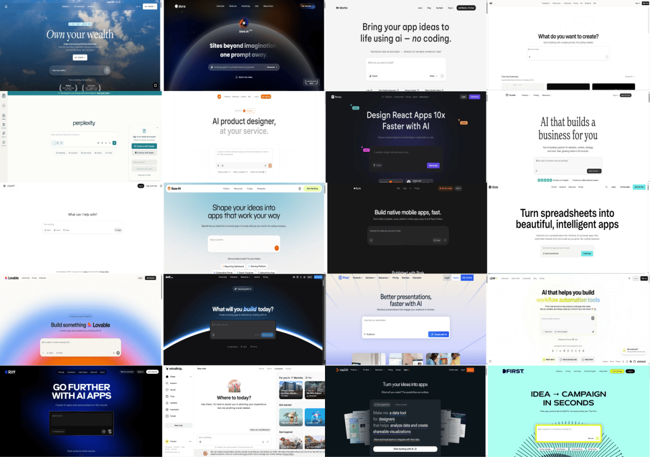
When every product opens with the same pattern, design no longer differentiates. The real question isn’t who can build a prompt bar. It’s who can turn that prompt bar into a moment of real, repeatable value.
We’ve entered the prompt-bar era, but we’re still using old playbooks to measure what success looks like. Now it’s time to unpack how to build an AI experience that actually delivers on its promise of instant value. Don’t worry, I’ll share plenty of real-world examples you can steal.
Bonus for premium subscribers: Get the full prompt bar journey library with onboarding flows from 40+ AI products. Keep reading until the end. (You can upgrade here.)
The myth of instant value
Anyone building AI products knows the truth: that prompt bar interface is both magical and maddening. The illusion of effortlessness hides how much friction still lives between prompt and value. Users don’t know what to type. Products don’t know who’s typing. That’s why the empty prompt bar has quietly become the new onboarding problem.
Think about it: every well-designed traditional onboarding flow used to guide users through context.
“Who are you?”
“What problem are you trying to solve?”
“What data do you need to connect?”
Now, that same context has to be captured through the experience itself.
The challenge is how: capturing context passively behind the scenes, or asking the classic profiling questions, but with more clarity, transparency, and purpose.
The truth is, it’s not either/or. The best teams do both. They ask what matters, infer what they can, and use every interaction—inside or outside the prompt bar—to guide users toward success.
The conversation itself is now the onboarding. The prompt is the setup, the action, and often the first value moment all at once. Which means activation can’t be treated as something that happens after sign-up. It happens immediately and continuously, in every prompt, every response, and every adaptation the system makes along the way.
If activation now begins inside the prompt, the question becomes: how do you design the loop that keeps users coming back?
The activation shift: from prompt to habit
Before we dive into frameworks and examples, it’s worth acknowledging something upfront. Every product is different, and so are its activation needs.
The patterns we’ll explore here are specific to AI products where a prompt-driven experience makes sense: tools where the user’s input or command plays a central role in reaching value. That doesn’t mean every SaaS product should adopt this model. Just as every onboarding flow needs to be tailored to a product’s audience and use case, the right activation design depends on the job your product is solving.
Even if you’re layering in AI-onboarding either with emerging tools like Quarterzip or Frigade, or in the product UX itself, it still doesn’t necessarily mean a prompt bar experience. You might find a compromise in letting users choose their preferred AI experience.
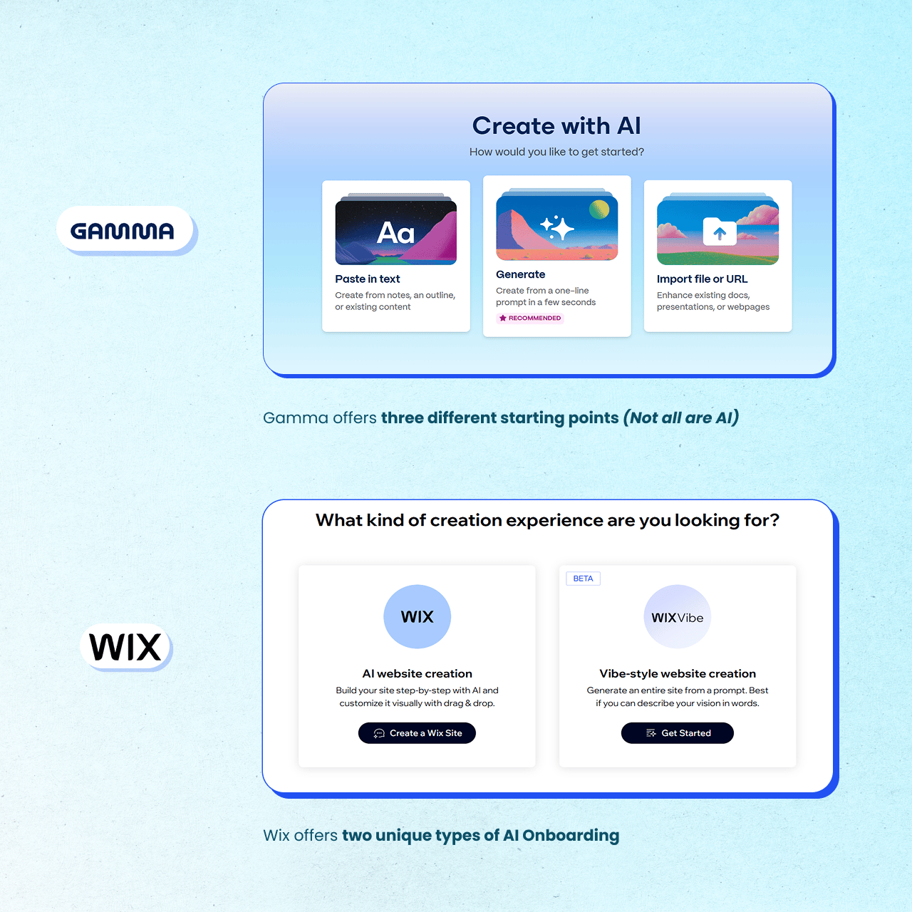
Wix, for example, offers two types of AI onboarding. Gamma gives users three different starting points. Not everyone wants to start with an AI prompt bar.
If your onboarding is no longer a series of screens but a single line of text, then activation itself has to evolve. We’re no longer guiding users through classic steps. We’re guiding them through loops.
In traditional product-led growth, activation followed a familiar path developed by Reforge:
Setup → Aha → Habit.
You helped the user get started, reach their first moment of value, and eventually form a repeatable pattern of success.
Today, activation happens inside a continuous conversational cycle:
Prompt → Context → Output → Action → Habit.
Each stage feeds the next. Each interaction teaches the system, and the user, what to expect. What used to be setup and “aha” moments now happen almost simultaneously, the second a user starts typing.
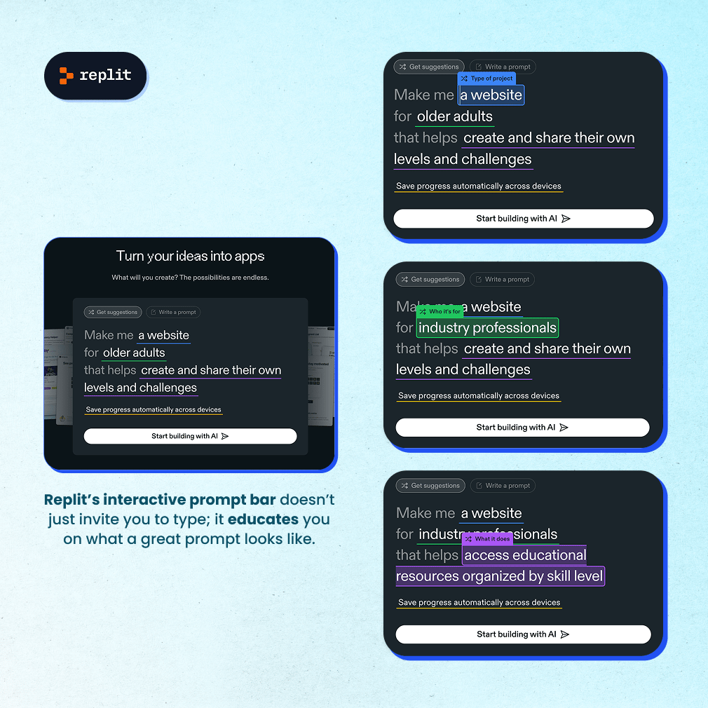
Prompt: The new “signup.” This is where users declare intent. A great prompt experience helps them express what they want without friction or doubt.
Replit’s homepage is an epic example. It doesn’t just invite you to type; it educates you on what a great prompt looks like.
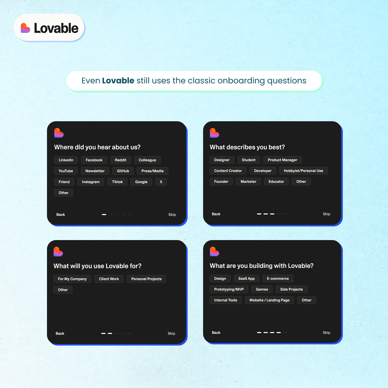
Context: The hidden setup. Some products infer it from behavior or connected data; others still ask explicit onboarding questions to better personalize results. Both paths work if they make the outcome more relevant.
Lovable, for example, still uses classic onboarding questions like where did you hear about us, what will you use Lovable for, what describes you best, and what are you building with Lovable.
Output: The moment of truth. The first result must be both impressive and useful. “Wow” gets attention, but relevance drives retention.
Action: The bridge. The most important first step in the actual product. Real activation happens when users apply what they got: editing, publishing, sharing, or integrating it into their workflow.
Habit: The loop compounds. Each prompt teaches the system and the user, tightening trust and shortening time-to-value.
Users still need to reach value fast and return often. The core activation metrics to track remain time-to-value (how quickly does the user get to their first meaningful output?) and retention (do they come back because the product made their work easier?). But in AI products, that journey might happen inside a single line of text.
Designing for real activation
Let’s move from conceptual into concrete product experiences that actually keep users coming back.
Designing for real activation starts with one principle: Cool ≠ Useful.
There’s a temptation to make every AI experience magical with flashy animations, creative suggestions, and clever empty states. The difference between an AI product that delights and one that retains users is simple: one stops at the first wow; the other builds a path to repeatable value.
You should focus most of your attention on the first prompt and its immediate next step. This is where most users either gain momentum or drop off.
What the best teams are doing right now:
1. Anchor in real use cases
Don’t just tell users they can “generate anything.” Show them specific, meaningful examples that connect to their job-to-be-done.
Canva does this masterfully. Its examples aren’t “Use AI.” They’re “Design a social post,” “Create a presentation,” or “Edit this photo.” Each of those leads to a tailored experience, visually distinct and purpose-driven.

TheBrief uses variety to inspire: clear prompts, multiple entry points, and a “Media Type” selector that encourages exploration.

2. Group prompts by intent
Help users understand what kind of tasks your product supports, whether that’s create, explore, analyze, or summarize.
You can frame these by outcomes, inputs, use cases, features, or integrations. The best prompt bars keep these examples short, scannable, and action-led.
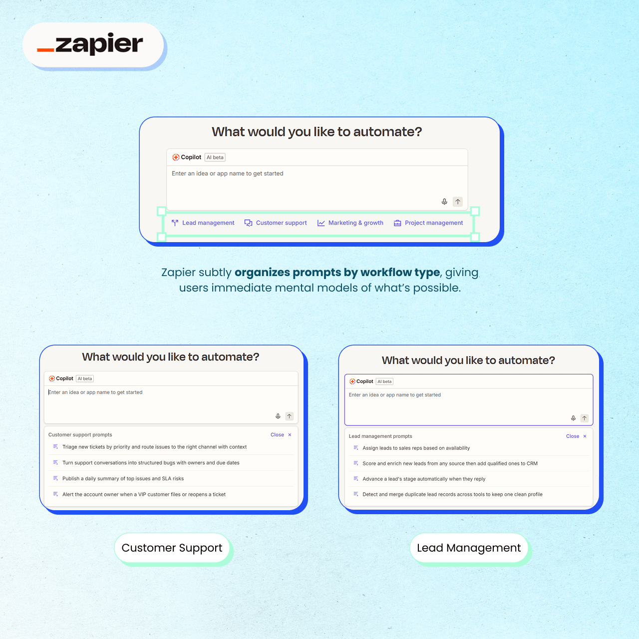
Zapier subtly organizes prompts by workflow type, giving users immediate mental models of what’s possible.
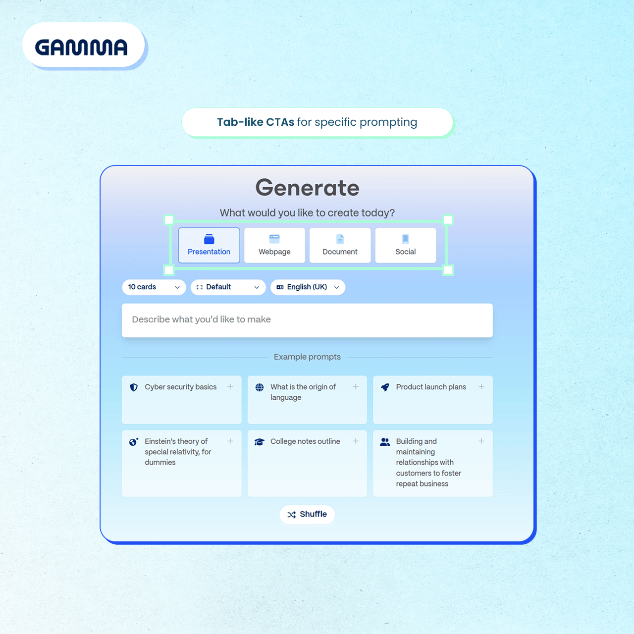
Gamma makes this very clear and easy to navigate with smooth tab-like CTAs.
This post may be cut-off by your email provider. Read the full version here.
3. Make the functions crystal clear
Different AI experiences serve different purposes. Some are builders, some assistants, some co-pilots. The UI should make that distinction obvious.
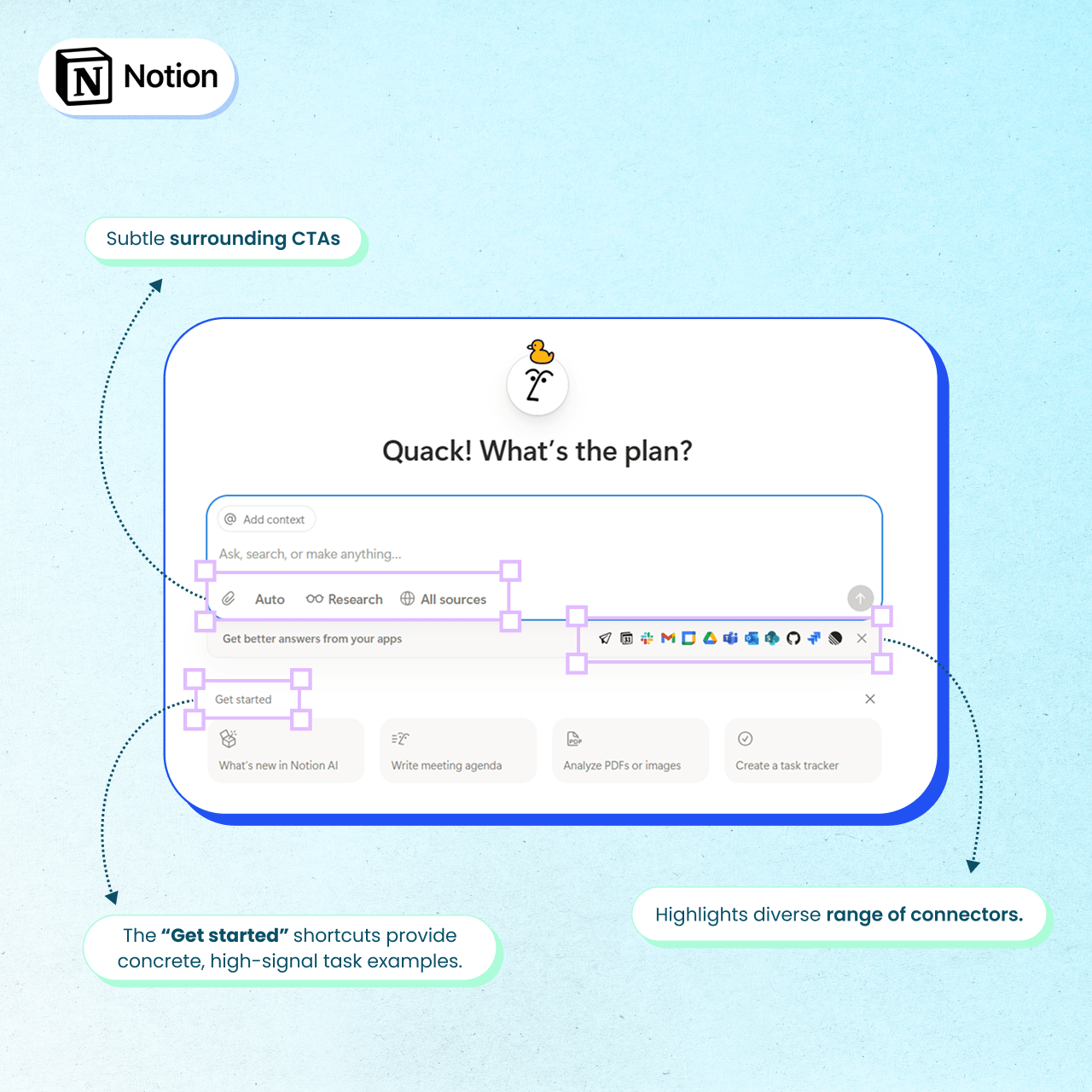
Notion nails this with a mix of placeholder text, surrounding CTAs, and examples that clearly convey what you can do and why.
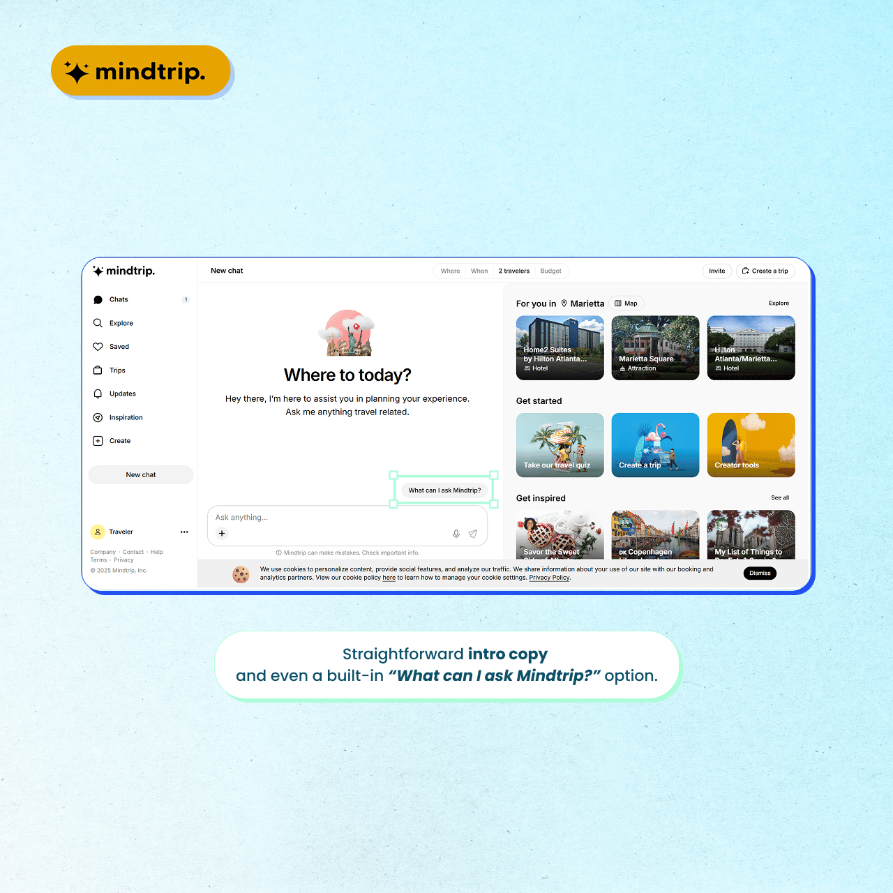
Mindtrip does it elegantly with straightforward copy and even a built-in “What can I ask Mindtrip?” option.
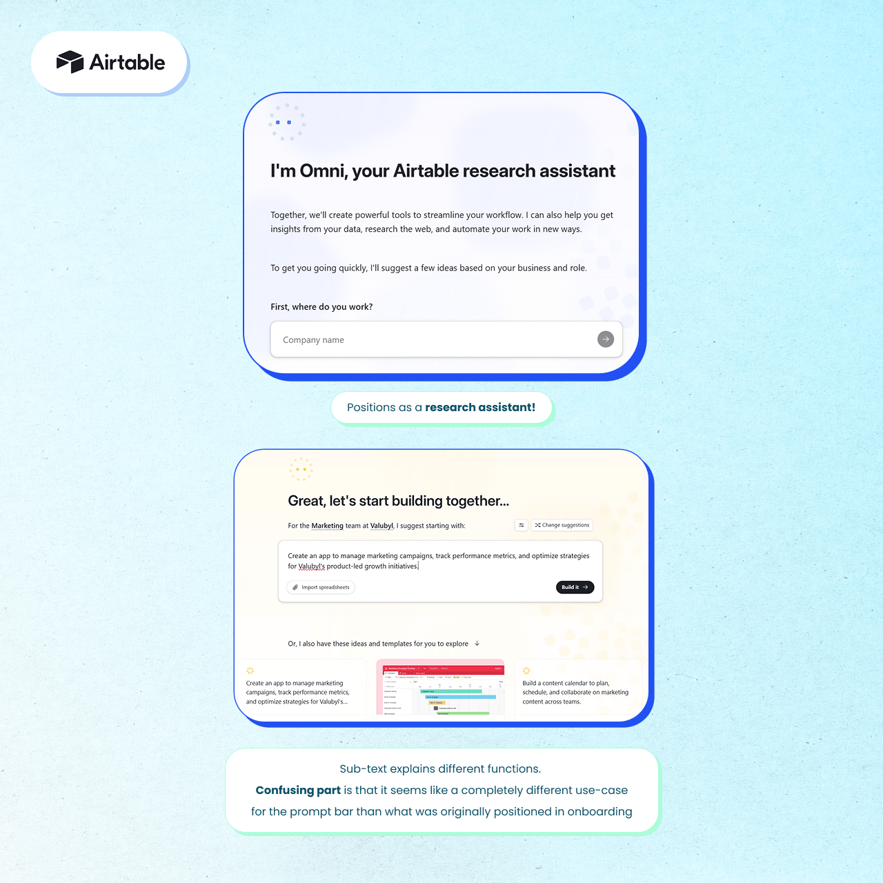
Airtable is a good example of subtle confusion to avoid. During the onboarding “Omni” is positioned as a research assistant even though the sub-text explains different functions I’ve already created a mental association with “research” when it’s true power is actually in building and can do so much more.
4. Integrate context, data, and sources
The strongest prompt experiences don’t live in isolation. They integrate every best starting point, so users never feel lost or miss out on core capabilities.
Notion, as seen above, clearly highlights the diverse range of connectors.
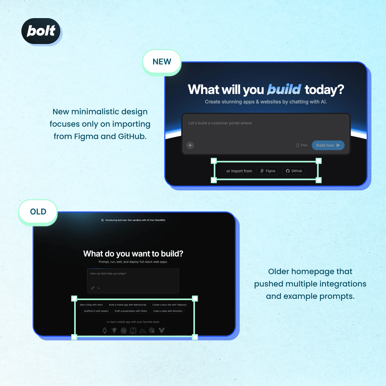
Bolt.new’s new minimalistic design focuses only on importing from Figma and GitHub. Interesting how it evolved from a tight, clear scope compared to its older homepage that pushed multiple integrations.
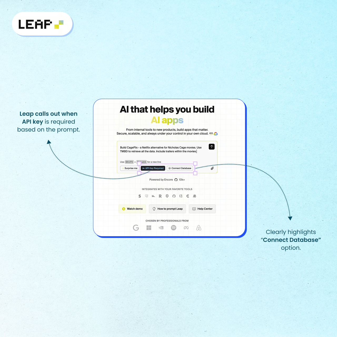
Leap uses subtle cutes like their “connect database” CTA. If you look closely, they even added an “API Key Required” highlight which is only present for specific prompts.
5. Always recommend a clear next step
Keep the momentum alive with an action button, approval step, or a subtle follow-up prompt.
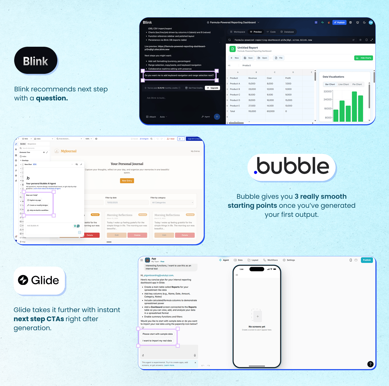
Blink handles this lightly with a question in the chat output.
Glide takes it further with instant next step CTAs right after generation.
Bubble’s personal AI agent gives you three really smooth suggestions once you’ve generated your first output: explain my app, create or modify designs, and help me build a workflow.
Some bonus touches I loved
The fun factor: Playfulness can lower hesitation. Riff and Leap use “Shuffle” or “Surprise me” icons to encourage exploration.

Social proof in context: Lovable and Vercel surface user-generated templates directly on their homepages, turning inspiration into conversion.
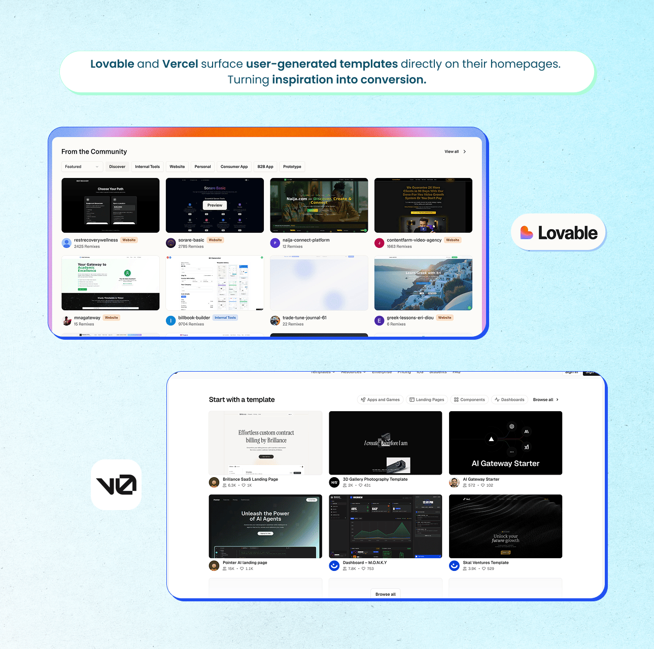
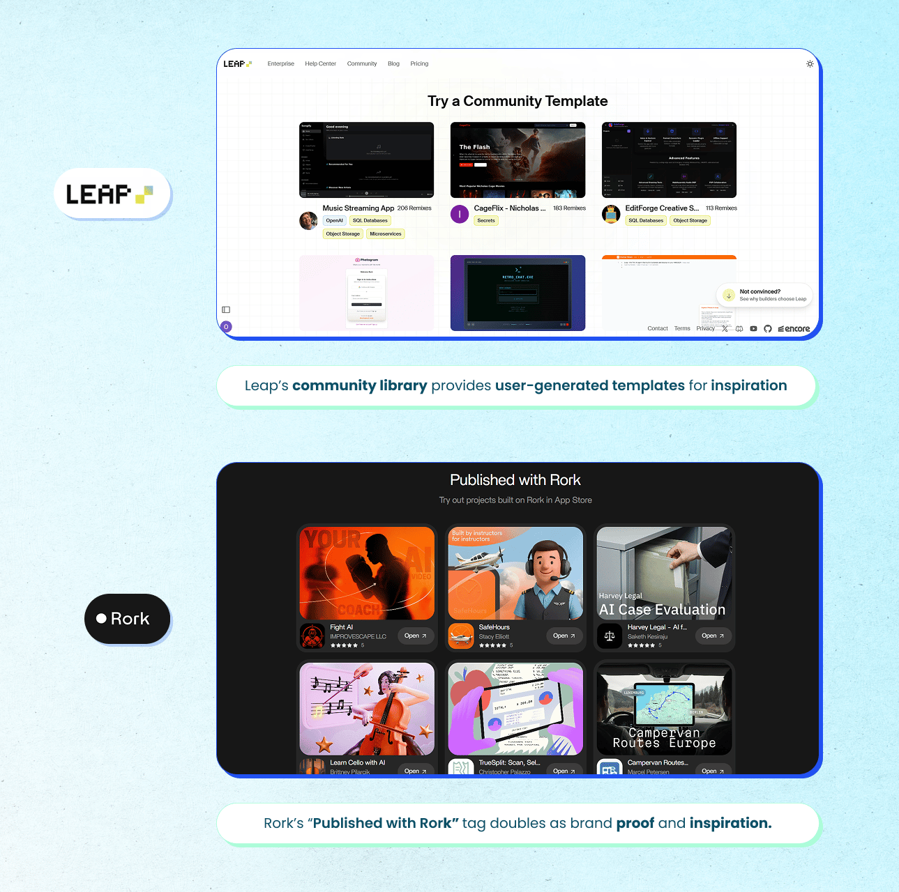
Leap’s community library extends that pattern inside the app. And Rork’s “Published with Rork” tag doubles as brand proof and inspiration. Users see what’s possible, not just what’s promised.
Closing thoughts (and the full prompt bar journey library)
Subscribe to Kyle Poyar's Growth Unhinged to read the rest.
Become a paying subscriber of Growth Unhinged to get access to this post and other subscriber-only content.
UpgradeA paid subscription gets you:
- Full archive
- Subscriber-only bonus posts
- Full Growth Unhinged resources library
